library(tidyverse) # general data wrangling7. Time zones
Time zones and loggers set to the wrong time zone are a special kind of misery. Countless blogs have been written about this particular form of ‘what-went-wrong’ torture, so if you find yourselves in a misery-needs-company mindset with regards to time-zones, a whole warren of rabbit holes of possible helpful advice exists in the interwebs. But suffice it to say it is important to understand the time-zone of your data, if time is important!
We’ll start by reading some sensor data from Niwot Ridge and doing a quick inspection as to what variables might clue us into the time zone we had set our loggers in.
df <- read.csv(file.path("example_data", "time_zones.csv")) %>%
  mutate(date_time = lubridate::ymd_hms(date_time))

glimpse(df)
Rows: 1,000
Columns: 2
$ date_time <dttm> 2018-09-11 05:00:00, 2018-09-11 06:00:00, 2018-09-11 07:0…
$ temperature <dbl> 9.475, 10.650, 11.449, 11.650, 11.871, 11.684, 11.234, 10.…Helpfully, this dataset contains air temperature, which can give us some rough clues to the time zone, if it’s not specified in the dataset or metadata. Oftentimes, a plot is enough to sort this out. It helps to zoom way on in on particular period to see the time of day.
# Plots a scatter plot of temperature against date_time for the first 40 rows of the input dataframe.
ggplot(head(df, 40), aes(x = date_time, y = temperature)) +
  geom_point() +
  theme_classic()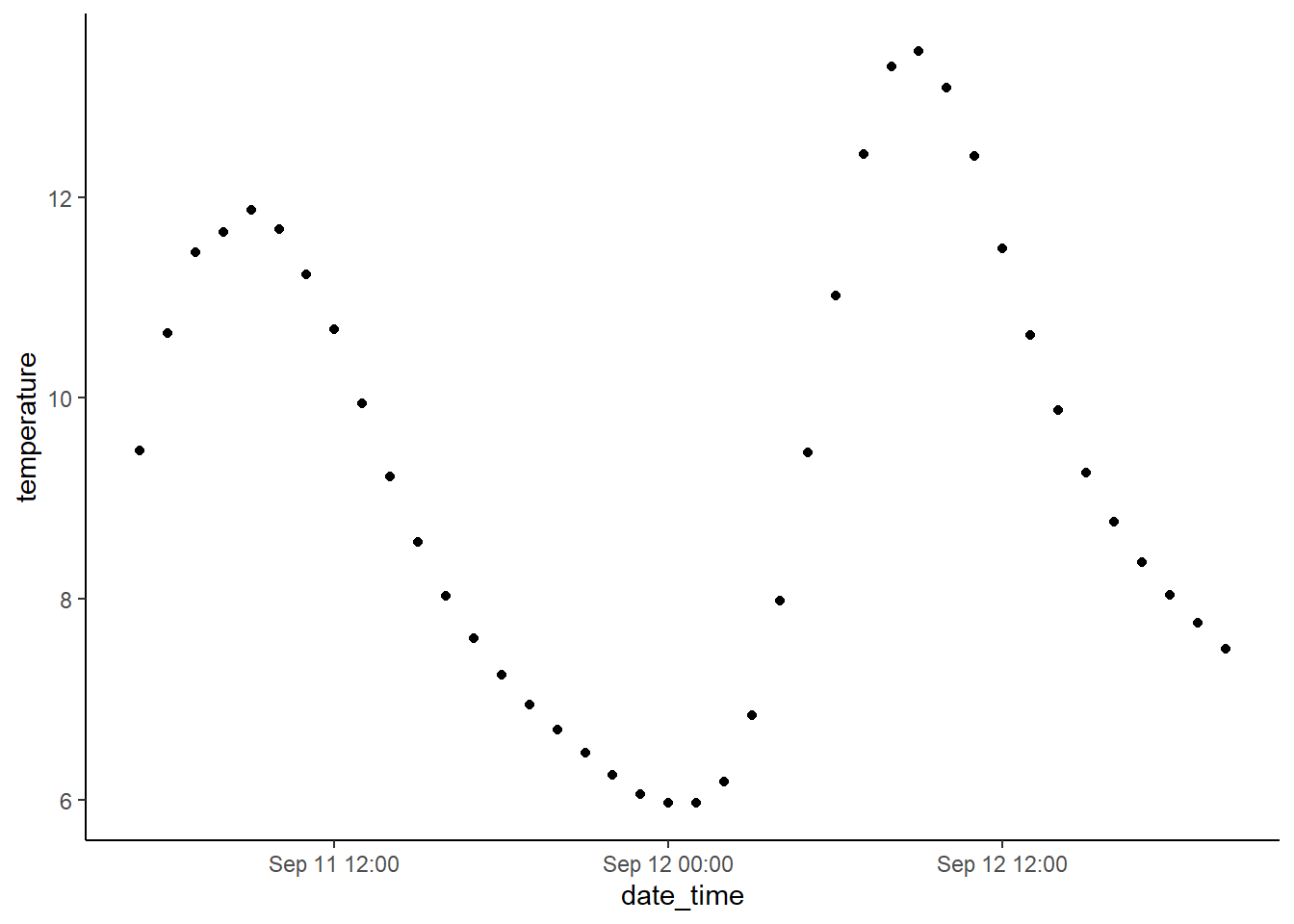
The sun only shines during the day, so variables like PAR and temperature are helpful indicators here. As anyone who has hiked around in the morning and afternoon is probably aware, typically the hottest tiems of day are ~4pm and it’s pretty unusual for the temperature to peak just before noon. In this case, the data appear to be in UTC. Sometimes UTC time is just what you want! Other times, you may want to convert the timezone to local.
# Mutates the 'date_time_colorado' column of the dataframe 'df' to force the timezone to 'America/Denver'.
df <- df %>%
  mutate(date_time_colorado = force_tz(date_time, "America/Denver"))
As always, check your work before proceeding!
# Plots temperature data against date_time in two different time zones.
# The first plot shows the temperature data in UTC time zone, while the second plot
# shows the temperature data in Colorado time zone.
# The data used for the plot is the first 40 rows of the dataframe 'df'.
# The plot includes a legend that shows the color mapping for each time zone.
ggplot(head(df, 40), aes(x = date_time, y = temperature, color = "black")) +
  geom_point(show.legend = TRUE) +
  geom_point(data = head(df, 40), aes(x = date_time_colorado, y = temperature, color = "red")) +
  theme_classic() +
  scale_color_identity(
    name = "Time zone",
    breaks = c("black", "red"),
    label = c("UTC", "Colorado"),
    guide = "legend"
  )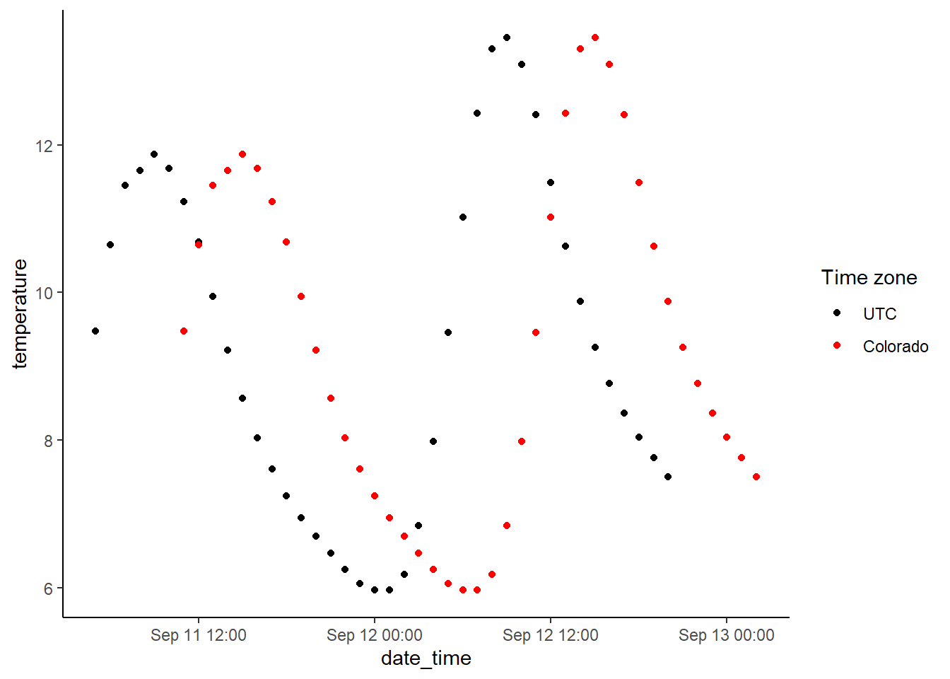
When working with sensor data from multiple sites or collections - I often find it helpful to plot the sensors from each location overtop eachother and/or plot data from different years on the same plot. This can quickly identify sensors that were set to different time zones.